Brand Identity for a Hair Braiding Salon
A hand-drawn monogram and decorative wordmark for a hair-braiding salon, extended into a branded repeat-pattern product line.
Where they started
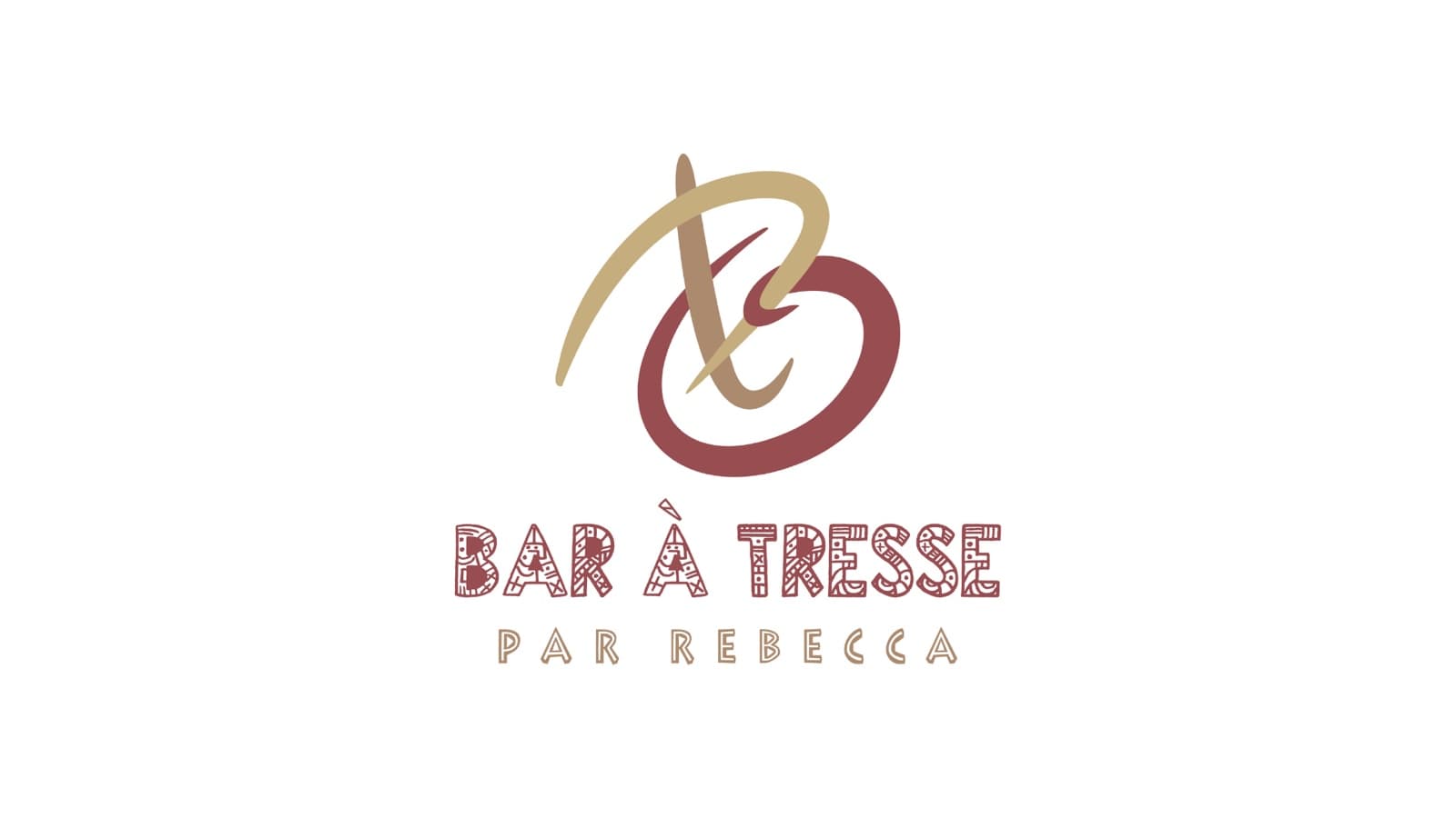
Bar à Tresse — "par Rebecca" — needed a mark with the warmth and craft of the braiding work itself: not a generic scissors-and-comb salon logo.
What we did
- 01
Designed a gestural, hand-drawn monogram in burgundy and gold — reads as artisanal, not corporate.
- 02
Paired it with a decorative, hand-tooled wordmark carrying the same craft feel.
- 03
Built out the full lockup system — primary color, black, and icon-only — so the mark holds up across every use case.
- 04
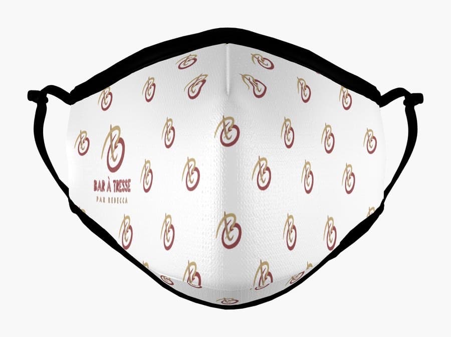
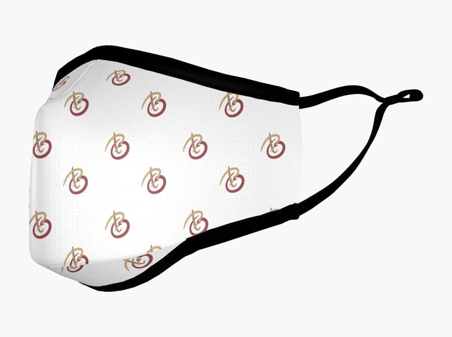
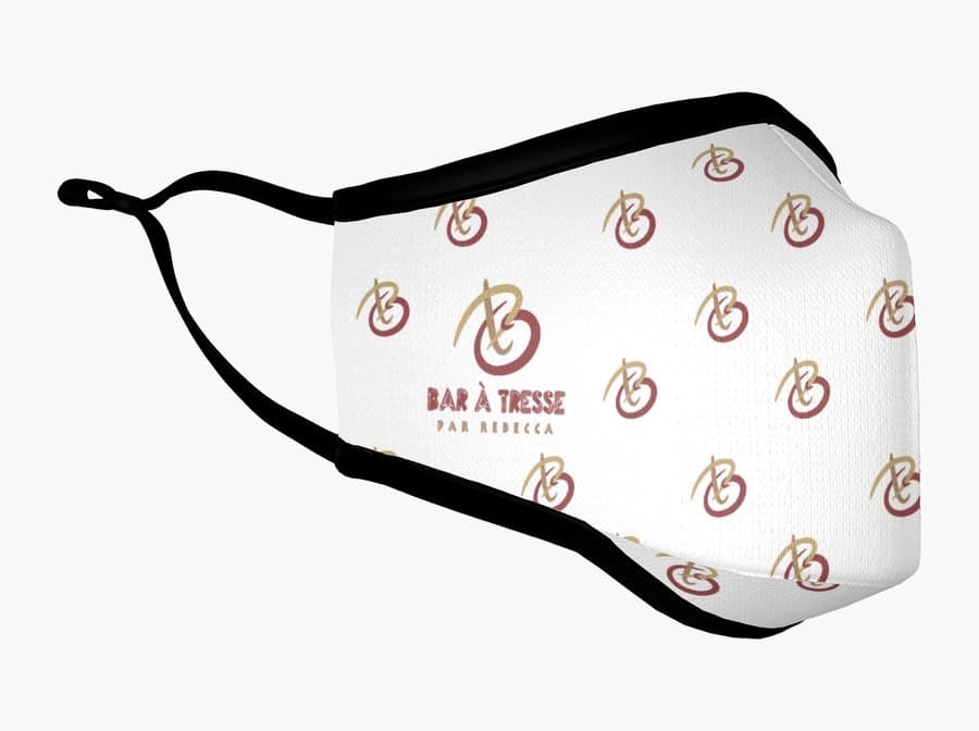
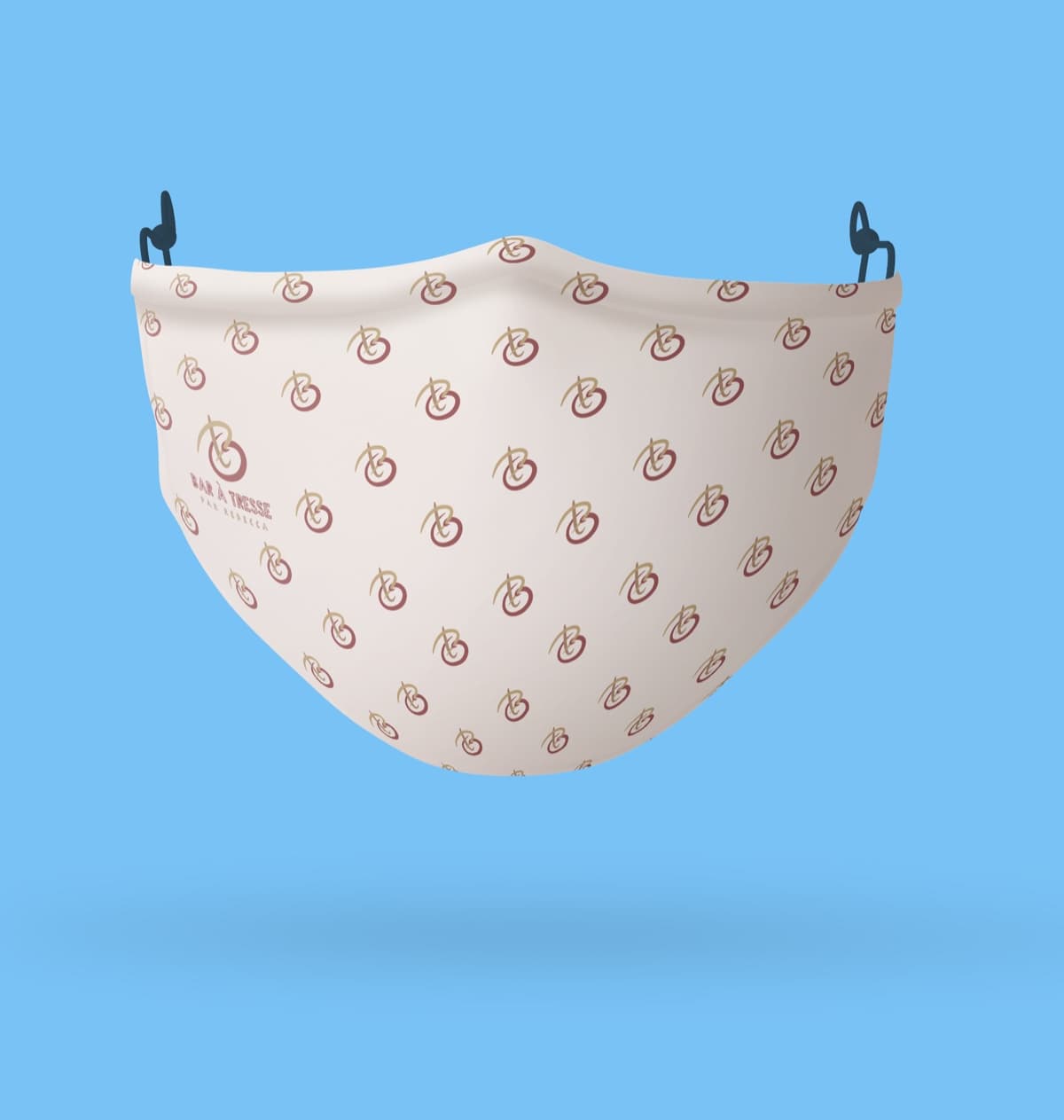
Extended the mark into a repeat pattern for branded product (face coverings), proving the identity works at small scale and in fabric, not just on a screen.
What we shipped
Logo system
Hand-drawn monogram + decorative wordmark, in color, black, and icon-only lockups.
Repeat pattern
Monogram adapted into a seamless pattern for branded product.
Product photography
Branded face masks styled and shot on-model, front and side angles.
A closer look