← All projects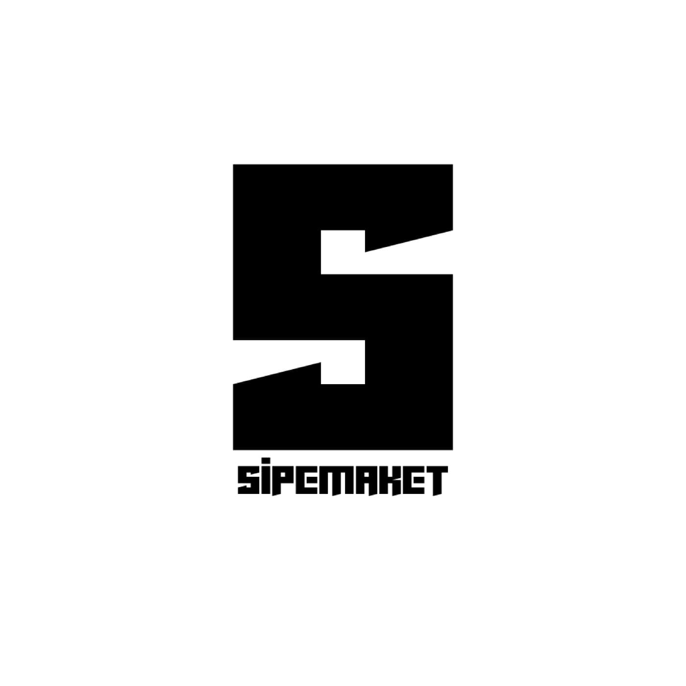
Retail·Sipemaket·Québec·2025
Logo Design for a Retail Brand
A sharp, geometric 'S' monogram built from a single continuous cut — a mark designed to work as a standalone icon before the wordmark even loads.
Logo Design
The brief
Where they started
Sipemaket needed a mark bold enough to stand alone as an icon — app tile, social avatar, packaging — with a wordmark to match its precision.
Our approach
What we did
- 01
Built the monogram from a single negative-space cut through a bold geometric block — reads instantly as 'S' at any size.
- 02
Paired it with an angular, technical wordmark in the same construction language.
Deliverables
What we shipped
Logo system
Geometric 'S' monogram + wordmark, monochrome system.
In Detail
A closer look