Brand Identity for a Women-in-Tech Community
Brand system for a community supporting women working in the SAP ecosystem. Logo, identity, and portrait-led visual direction grounded in confidence and warmth — not the generic 'women in tech' template.
Where they started
Eliane needed an identity that could carry across events, social, and a future website without feeling like every other women-in-tech brand on LinkedIn. The community is specific — SAP professionals — and the brand had to honor that without becoming jargon.
What we did
- 01
Researched the women-in-tech category — most brands rely on circuit-board imagery or pastel pink. We routed around both.
- 02
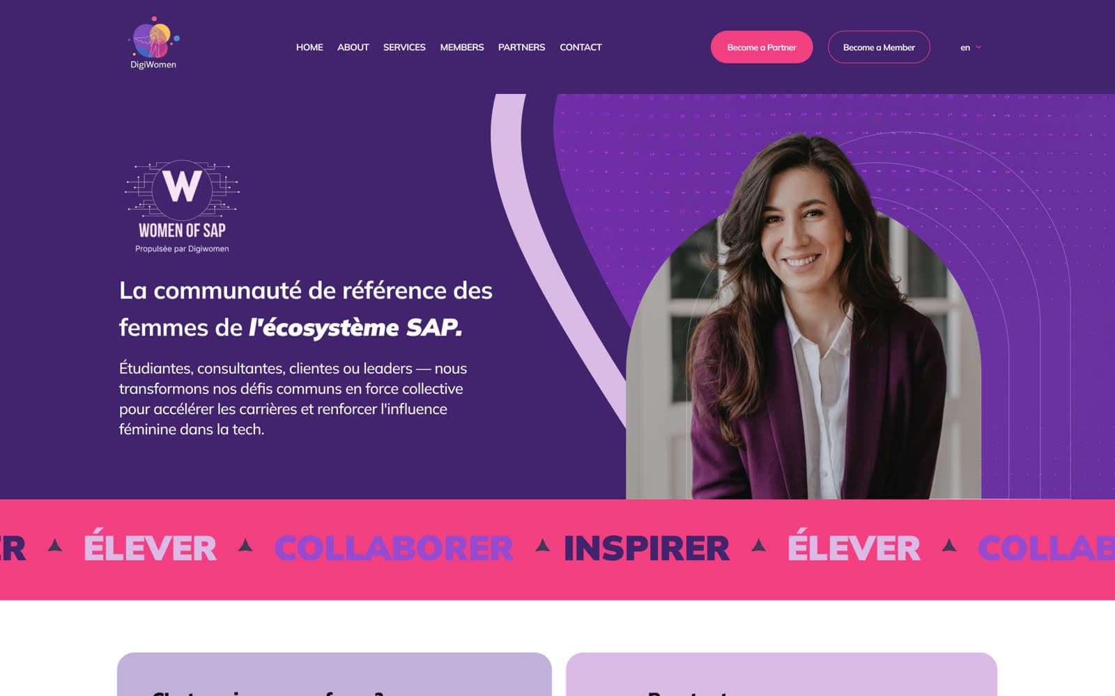
Built a wordmark + portrait visual direction. Portraits lead, type supports.
- 03
Delivered logo variants for light + dark backgrounds, extended to event collateral and social-format crops.
What we shipped
Primary logo + variants
Wordmark in white, black, and full color. SVG, PNG, JPG for every event/print/web context.
Visual direction
Portrait-led photography direction, palette, and type system extending the brand across surfaces.
A closer look